Project Overview
FizzBurn, a revolutionary weight loss and body toning supplement, needed a compelling landing page to capture the attention of a competitive market. The project aimed to showcase the product's unique benefits, combining powerful copywriting with a visually engaging design to drive conversions and resonate with women over 30 seeking a holistic wellness solution.
The Challenge
The weight loss supplement market is saturated with promises and products. The core challenge was to differentiate FizzBurn, crafting a unique hook that resonated with the target audience of women over 30 and establishing immediate trust. Simply listing features wasn't enough; the copy needed to evoke a sense of possibility and address the emotional needs of the target demographic.
Beyond the copy, the design played a crucial role. The challenge was to create a visually appealing, clean, and user-friendly layout that complemented the copy, enhancing its impact and guiding the user seamlessly through the information. Making sure copy and design work harmoniously together, each strengthening the other, was paramount.
Strategic Approach
Market Research & Identifying the Unique Hook
I delved into online communities, forums, and reviews related to weight loss and wellness for women over 30. This revealed common frustrations with existing solutions, such as slow results, complex routines, and concerns about artificial ingredients.
This research led to the core hook: highlighting FizzBurn as an "All-In-One Solution" that addressed not just weight loss, but also energy levels, mood improvement, and skin revitalization. This multi-faceted approach set FizzBurn apart from single-benefit competitors.
Crafting the Headline & Core Message
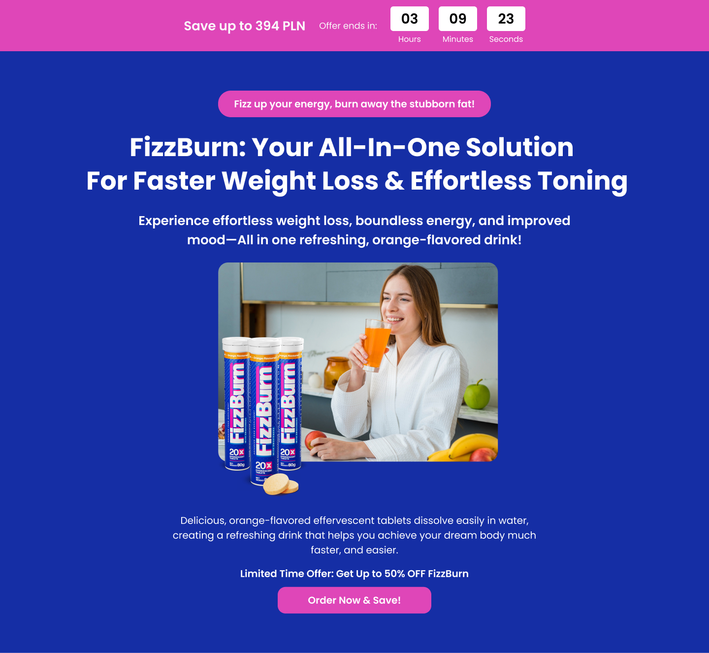
The headline, "FizzBurn: Your All-In-One Solution For Faster Weight Loss & Effortless Toning," was designed to be direct, benefit-driven, and immediately address the core desires of the target audience.
The subheadline, "Experience effortless weight loss, boundless energy, and improved mood—All in one refreshing, orange-flavored drink!" expanded on the core promise, adding sensory details and emphasizing the ease of use.
Structuring the Copy & Design Flow
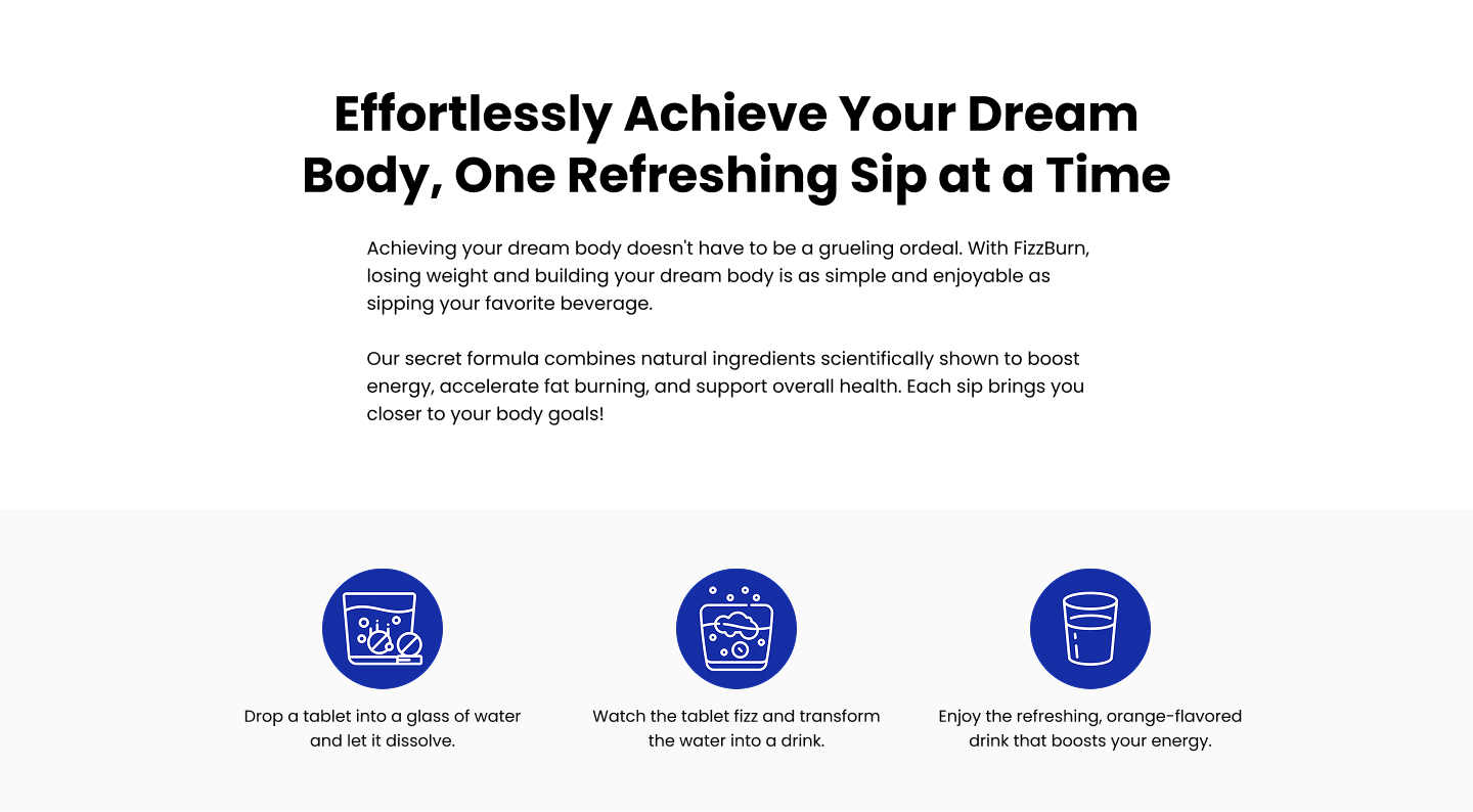
The landing page was structured to present a clear and logical flow of information:
- Problem/Agitation: Started by acknowledging the challenges of weight loss and body toning, creating immediate empathy.
- Solution Introduction: Presented FizzBurn as the unique solution, highlighting its multi-faceted benefits.
- Feature Breakdown: Detailed the key ingredients and their specific benefits, using clear visuals and concise language.
- Social Proof: Incorporated compelling testimonials from real women over 30 to build trust and credibility.
- Call to Action: Offered a limited-time discount and a risk-free guarantee to incentivize immediate action.
The design mirrored this flow, using distinct sections, clear headings, bullet points, and high-quality images to guide the reader's eye and maintain engagement. White space was used strategically to prevent the page from feeling overwhelming.
Highlighting Benefits & Addressing Objections
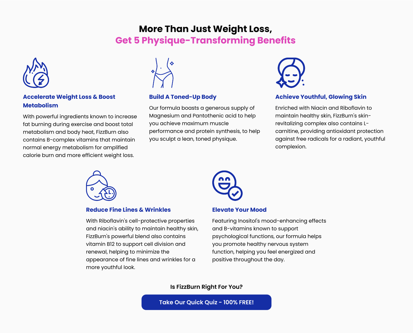
Instead of just listing ingredients, each component of FizzBurn (Taurine, L-Carnitine, etc.) was presented with its specific benefits, connecting them directly to the desires of the target audience (e.g., "Sculpt Lean Muscle & Boost Performance").
The "More Than Just Weight Loss" section expanded on the holistic benefits, visually representing five key areas: weight loss, body toning, skin health, wrinkle reduction, and mood elevation. The design used icons and imagery to make these benefits instantly understandable.
A section was dedicated to testimonials from the target demographic. The 90-day money-back guarantee was prominently displayed to address any lingering doubts and build trust.
Conversion Optimization
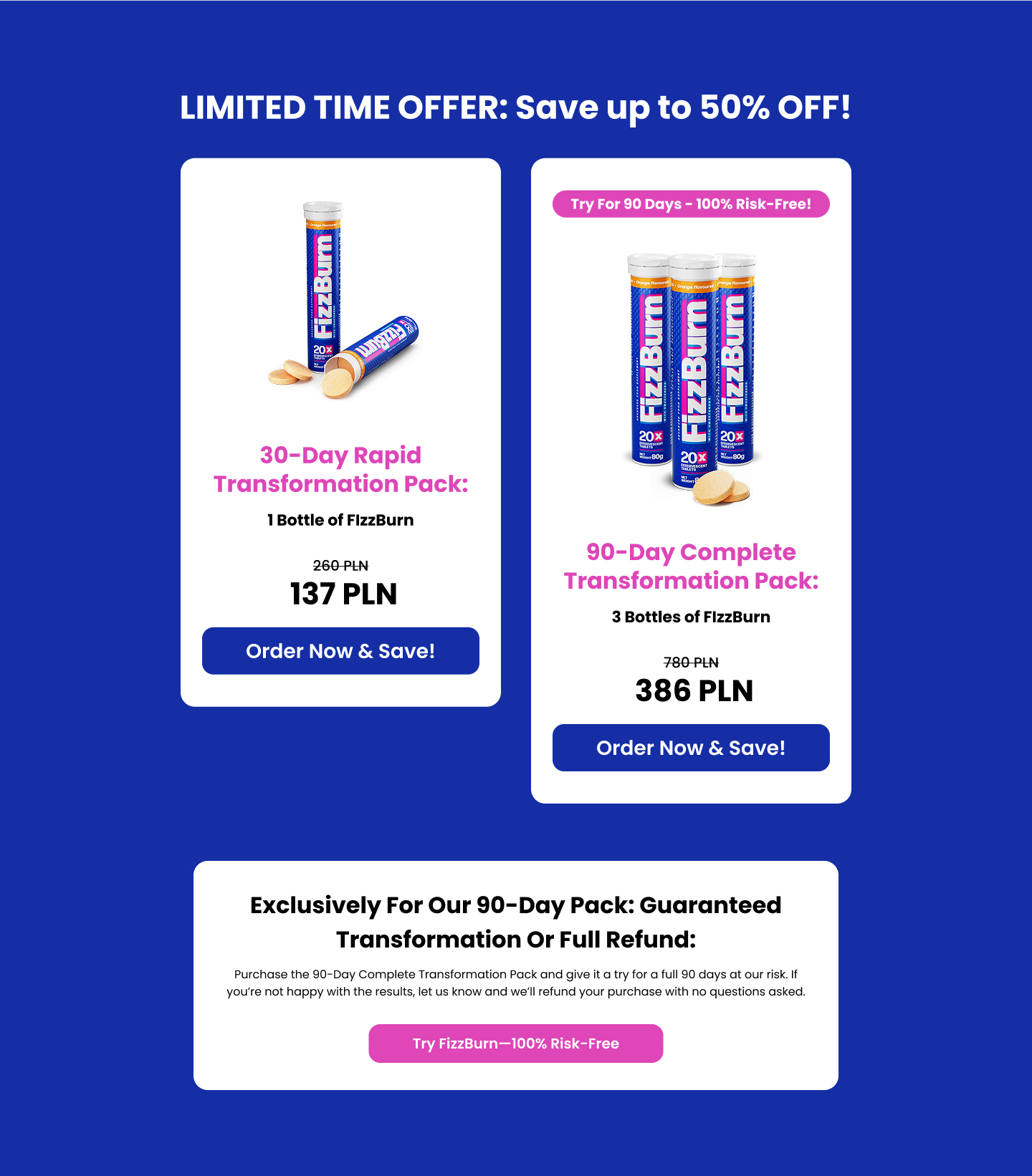
Multiple, strategically placed call-to-action buttons ("Order Now & Save!") were used throughout the page, making it easy for users to take the next step.
The limited-time offer ("Save up to 50% OFF!") created a sense of urgency.
The pricing structure was presented clearly, highlighting the savings of the 90-day pack and reinforcing the value proposition.
The Outcome
The final FizzBurn landing page delivered a clear, captivating, and conversion-focused message, presented within a visually engaging and user-friendly design. The copy and design worked seamlessly together to highlight the product's unique benefits, address potential objections, and drive users towards purchase.
The page effectively positions FizzBurn as a comprehensive and trustworthy solution for women over 30 seeking a holistic approach to weight loss and well-being. By blending persuasive copy with an appealing design, the landing page successfully overcame the challenge of standing out in a crowded market.